Meteor-example-autoform is a Meteor application that provides a simple implementation of an HTML form using the AutoForm plugin along with Twitter Bootstrap.
I wrote this application to complement the AutoForm documentation and online AutoForm tutorials. Specifically, I wanted to provide example code for Radio Buttons, Checklists, and multiple selection.
The code also uses explicit publish and subscribe and Meteor methods. This means the insecure and autopublish packages are not enabled.
I previously wrote a similar application called play-example-form to illustrate form processing in the Play Framework. It's interesting to compare the two implementations.
Basic usage
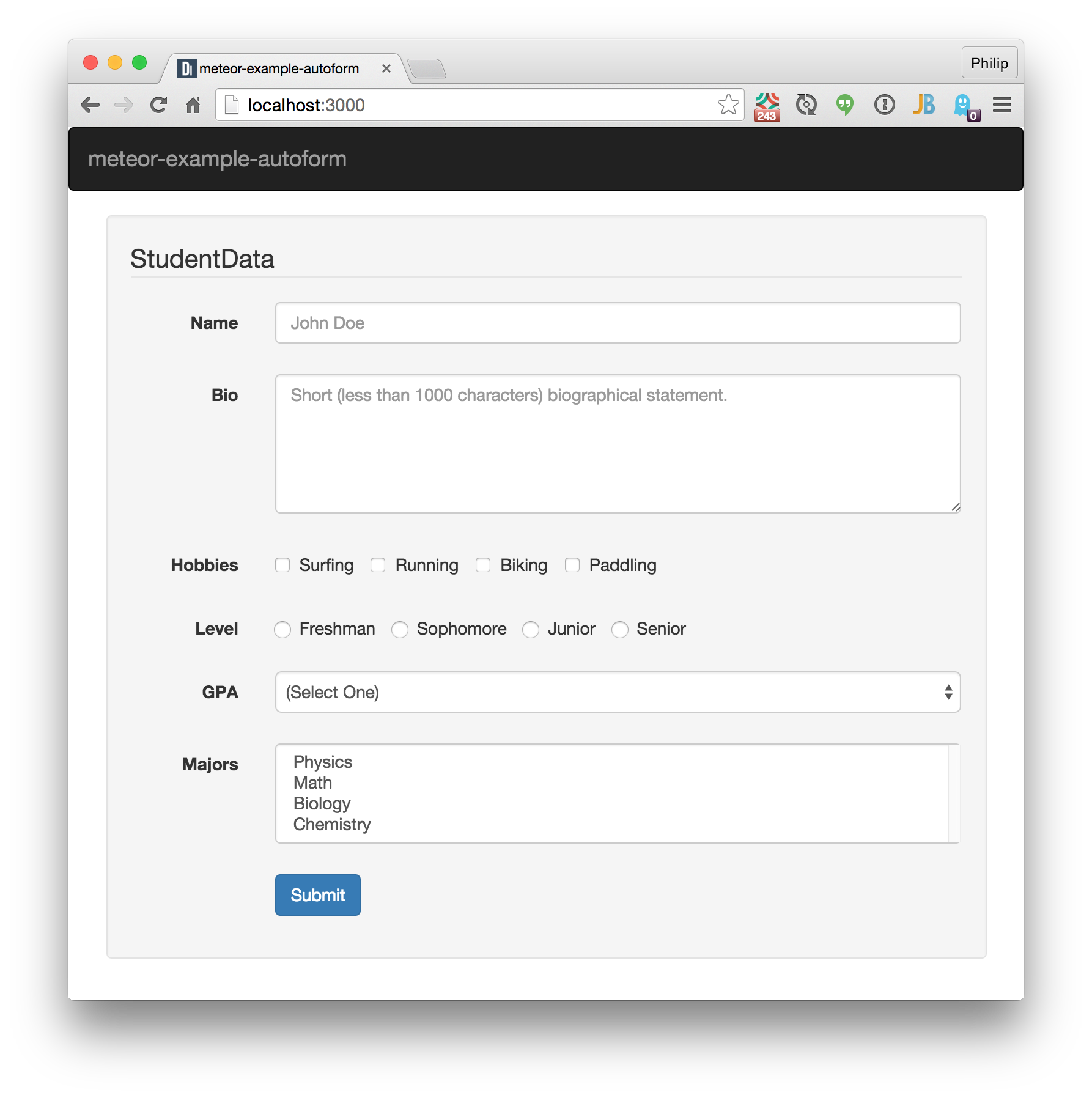
Download the application and type meteor, then display http://localhost:3000 to bring up a window similar to the above.
The application consists of two pages: the home page that enables the form and enables you to create new StudentData documents, and a second page that allows you to edit a pre-existing StudentData document. To use this second page, open up the browser console and submit a new StudentData instance. The form will be reset, and you should see the docID printed out to the console:
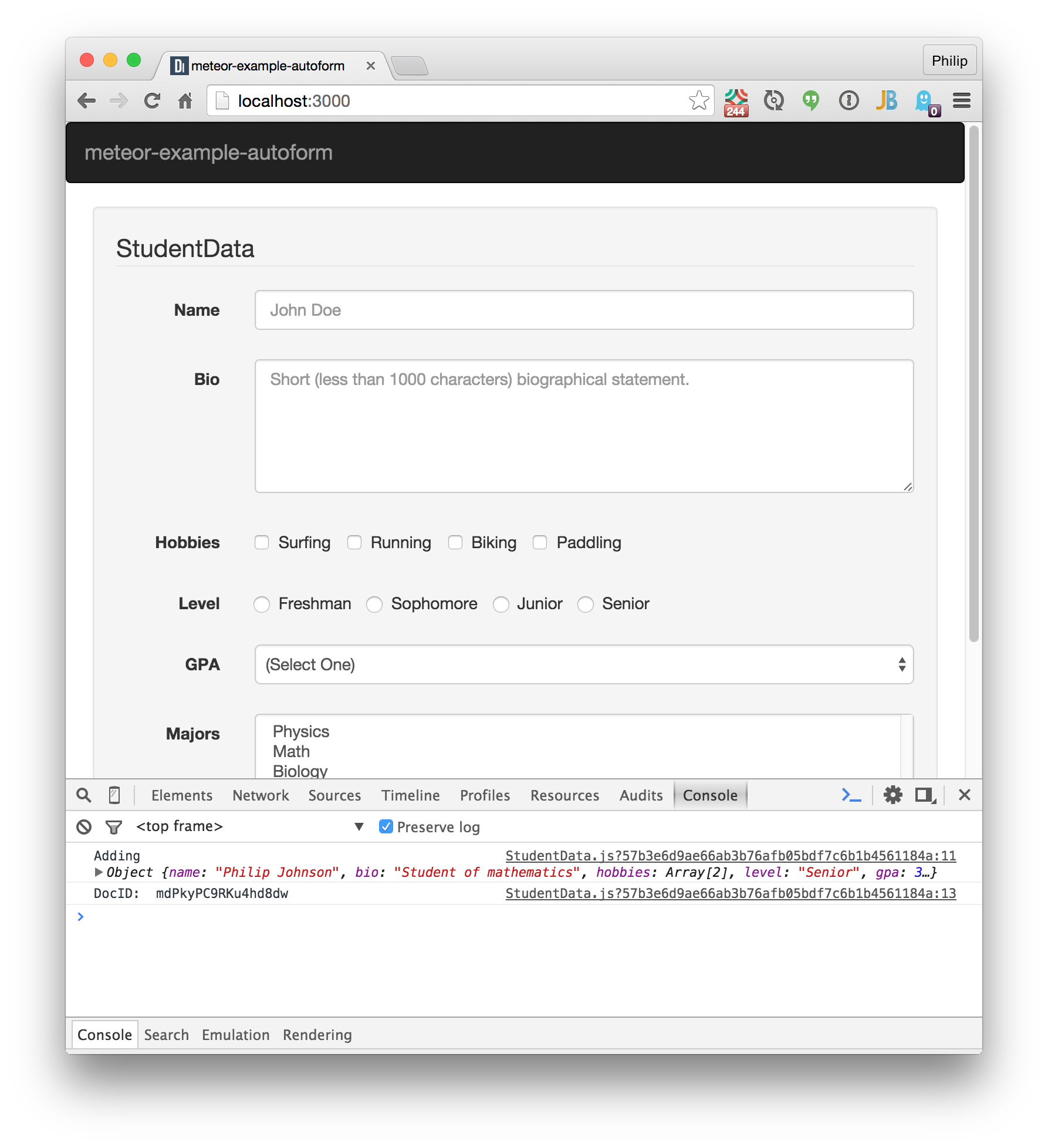
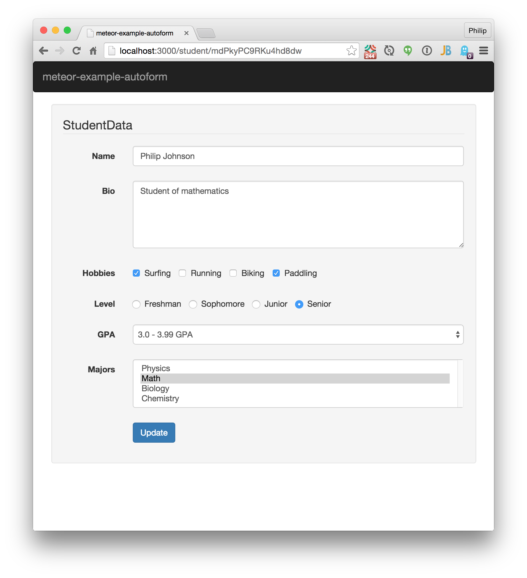
Copy the docID, and then create a URL in the address bar with student/<docID>. Retrieving that URL will display the newly created StudentData document and allow it to be edited:
One way to test your understanding of this code is to clone this repo and augment the application to display a table of all created StudentData instances and an "Edit" button to display the selected student on the second page.
Walkthough
Let's take a quick look through the code.
Packages
Here's the output of meteor list as of the time of writing:
aldeed:autoform     5.5.1  Easily create forms with automatic insert and update, and automatic reactive validation.
aldeed:collection2  2.5.0  Automatic validation of insert and update operations on the client and server.
iron:router         1.0.9  Routing specifically designed for Meteor
meteor-platform     1.2.2* Include a standard set of Meteor packages in your app
sacha:spin          2.3.1  Simple spinner package for Meteor
twbs:bootstrap      3.3.5  The most popular front-end framework for developing responsive, mobile first projects on the web.
AutoForm and Collection2 the two packages you want for forms. Iron Router does routing. Bootstrap provides the CSS framework. The Spin package is unimportant for this tutorial; it just provides a spinner widget while the subscription is being completed.
Routing
The application consists of two pages: a home page (which we'll call "AddStudentData") that enables you to create a new StudentData document, and a second page (which we'll call "EditStudentData") that enables you to edit a pre-existing StudentData document.
Because there are two pages, it makes sense to use a router. This application uses Iron Router.
The routing code is in a single file: lib/router/router.js:
A "layout" template is specified to provide boilerplate Bootstrap code, found in client/templates/application/layout.html.
When the application is first retrieved by a client, the router will subscribe to the StudentData collection. A loading template will be shown while the subscription runs, and this displays the spinner provided by sasha:spinner.
Two routes are defined: "/" which will display the AddStudentData template, and "/student/:_id" which will display the UpdateStudentData template. Both templates are defined in client/templates/studentdata/studentdata.html.
When the client submits a URL with the /student route, the next part of the path should provide the docID for the student to be retrieved. (No error checking is done. Discover Meteor has a nice tutorial on how to support error checking in Iron Router.)
The StudentData Collection
A primary component of form definition occurs in lib/collections/studentdata.js which contains the code to define the StudentData collection, the Meteor Methods for adding and updating StudentData documents, and the schema definition for StudentData documents.
For example, here is the schema definition for the "Level" field in a StudentData document:
  level: {
    label: "Level",
    type: String,
    optional: false,
    allowedValues: ['Freshman', 'Sophomore', 'Junior', 'Senior'],
    autoform: {
      group: studentData,
      type: 'select-radio-inline'
    }
  }
This schema definition indicates that:
- Level is a required field containing a String.
- Level has four allowed String values,
- AutoForm should display it inside a FieldSet with legend "StudentData"
- AutoForm should display it as an inline (horizontal) list of radio buttons.
The schema thus specifies both structural (i.e. the type of allowable value) and presentation (i.e. what HTML form control should be used).
Review the other field definitions to see how to specify other form components.
Templates
The schema specifies most of the information required by AutoForm for this example application. The two templates in client/templates/studentdata/studentdata.html are quite simple. Here is one:
<template name="AddStudentData">
  <div class="well">
    {{> quickForm
    collection="StudentData"
    template="bootstrap3-horizontal"
    label-class="col-sm-2"
    input-col-class="col-sm-10"

    id="AddStudentDataForm"
    type="method"
    meteormethod="addStudentData"
    resetOnSuccess=true}}
  </div>
</template>
For this application, we can use quickForm, the most simple of AutoForm's options. We specify the Collection (which provides AutoForm with access to the Schema), and some Twitter Bootstrap layout information (a horizontal form layout and column width information). We indicate that we want to use Meteor methods and which method to invoke.
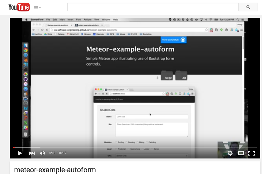
Screencast
Click the image below to watch a 10 minute walkthrough of this system.
Issues: Form Help Text
With one exception, the implementation of this form in Meteor using AutoForm was quite straightforward.
The exception is this: I originally hoped to replicate the following form from play-example-form:
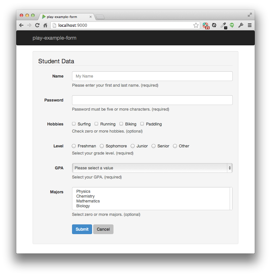
Unlike the Meteor version, play-example-form provides help text (the grey text underneath each form control documenting how the user should respond).
As far as I can tell, providing help text in AutoForm is not possible with quickForm component, nor is it even possible with the autoForm component, which provides fine-grained control over individual fields.
Instead, in order to obtain this very common and highly useful UI element, you must apparently define a theme template, which will differ in only minor ways from the built-in one.
For the novice user of AutoForm who requires help-text, a legitimate question becomes whether it is better to fork a predefined template and implement this feature, or just abandon AutoForm entirely and roll one's own form processor.
I believe the AutoForm package significantly simplifies form development, and that it is a design oversight to require developers who merely wish to include form help text to learn an advanced AutoForm mechanism to achieve it (and then manually maintain their copy of the template as Bootstrap and AutoForm evolve over time.) A much better solution is for the AutoForm developers to include a help-text option in the Schema that can be used by the predefined templates:
  level: {
    label: "Level",
    type: String,
    optional: false,
    allowedValues: ['Freshman', 'Sophomore', 'Junior', 'Senior'],
    autoform: {
      group: studentData,
      type: 'select-radio-inline',
      help-text: 'Select your grade level. (required)'
    }
  }
With this simple enhancement, users requiring help text could enjoy the simplicity of the quickForm option.